Introduction
Walk down any grocery aisle and you'll witness the same phenomenon playing out thousands of times a day: shoppers scan a shelf, pause for a fraction of a second, and reach for a product — often without consciously knowing why. According to Explorer Research, food packages have less than 2 seconds to capture shopper attention in an environment with roughly 45,000 competing SKUs. In that window, there's no room to be vague, forgettable, or confusing.
Food branding is different from general branding in one critical way: it has to do emotional and sensory work before a single bite is taken. Appetite, trust, nostalgia — all of it must register through packaging, visuals, and copy before the product ever reaches a shopping cart.
This guide covers everything you need to build a food brand that converts: the five core elements of food brand identity, why packaging is your most powerful selling tool, a step-by-step strategy framework, and real-world brand examples worth studying.
Key Takeaways
- Food branding is the complete system of visual, verbal, and emotional signals that shape how shoppers perceive and choose your product.
- Strong food brands are built on five pillars: logo, color palette, brand voice, brand story, and packaging design.
- Packaging is your #1 branding touchpoint — it must communicate value and trigger purchase intent within seconds.
- Building a food brand starts with a sharp USP and a consistent visual identity anchored by a story your target buyer actually connects with.
- Social media, influencer partnerships, and trade events extend your brand's reach and get your product into shoppers' hands for the first time.
What Is Food Branding (and Why It Matters)?
Food branding is the deliberate process of crafting a product's identity — through visuals, language, packaging, and story — so that consumers recognize it, trust it, and choose it over alternatives on that shelf.
That identity runs deeper than a logo or a color palette. It's the complete impression your product makes the moment a shopper's eye lands on it.
Why Food Branding Carries Unique Weight
Most industries have time to make their case. Food doesn't. POPAI's Shopper Engagement Study found that 76% of purchase decisions are made in-store, often at the shelf itself. That means your brand — not your advertising, not your website — is doing the selling.
Food purchasing is also deeply tied to emotion, habit, and sensory expectation. A shopper doesn't just want calories; they want comfort, excitement, health, indulgence, or identity. Your brand must signal the right emotional cues before the product is even opened.
Three Business Outcomes Strong Food Branding Drives
| Outcome | What It Means |
|---|---|
| Brand Awareness | Shoppers recognize your product on shelf and online without needing to read every word |
| Consumer Trust | Design quality, brand story, and certifications that earn repeat purchases |
| Sales Lift | Packaging and brand cues that compel first-time trial from a new or undecided shopper |
When all three align, your packaging works as a salesperson: converting undecided shoppers into first-time buyers, and first-time buyers into regulars.
The Core Elements of a Strong Food Brand Identity
Every durable food brand is built on five foundational elements. Skip one, and the whole system weakens.
Logo Design
A food logo must be instantly legible at multiple sizes: shelf, website, social thumbnail, and sell sheet. Shape language matters more than most brands realize.
- Rounded/curved logos read as approachable and friendly — well-suited for most CPG snacks, kids' foods, and everyday grocery staples
- Angular or geometric logos convey premium, precise, or formal — better suited for specialty foods, gourmet items, and health-focused products
- Typography-driven wordmarks often outperform complex symbols on packaging because they carry brand associations that consumers recognize in seconds
DePersico Creative's approach to logo design prioritizes legibility at three to five feet — the distance at which most retail shelf decisions happen. A logo that looks sharp on a design screen but becomes illegible under fluorescent store lighting is a liability, not an asset.
Color Psychology in Food Branding
Color is one of the fastest communication tools available to a food brand. Research published in a 2023 systematic review on packaging color found that warm hues like red and yellow are consistently associated with arousal, attention, and excitement in food packaging contexts.
Here's how common color choices map to category positioning:
- Red and orange — energy, appetite stimulation, urgency; dominant in fast food and snack branding
- Yellow — warmth, friendliness, accessibility; effective for everyday grocery products
- Green — health, natural, organic, sustainability; the default signal for better-for-you positioning
- White and off-white — clean, premium, minimalist; used to differentiate in cluttered categories
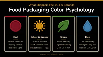
One important nuance: a 2024 peer-reviewed study found that warm colors increased purchase intentions specifically for indulgent "vice" foods, while cool colors worked better for "virtue" foods like health snacks. Color strategy should match the product's positioning, not just follow category conventions.
Brand Voice and Creative Language
Brand voice is how your product speaks — its personality, tone, and the specific words it uses. It must stay consistent across packaging copy, social media, your website, and ads.
Two common voice profiles in food branding:
- Playful and conversational — snack brands, kids' foods, fun-forward CPG
- Authoritative and considered — health-focused brands, specialty/gourmet, functional foods
Beyond tone, the words you choose on packaging are a strategic lever that most brands underuse. "Fire-roasted" versus "cooked." "Slow-simmered" versus "heated." "Hand-crafted" versus "made." These aren't just stylistic choices — they create entirely different emotional and sensory responses.
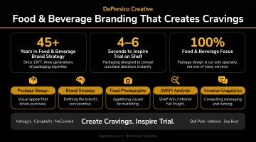
DePersico Creative calls this discipline creative linguistics — using the most precise, evocative words to create immediate appeal on packaging. Their process is built around four questions shoppers subconsciously ask at shelf:
- What is this product?
- What will I experience?
- What do I want from this category?
- What does this offer that competitors don't?
The answers feed directly into package copy, taglines, and brand story.
For Idahoan's Steakhouse™ sub-brand, DePersico's creative linguistics and packaging work contributed to a 75% incremental sales increase for casseroles and a jump in casserole segment share from 11.6% to 23.1%.
Brand Story
A brand story gives consumers a reason to care beyond the product itself. Whether it's a founding narrative, a sourcing story, or a transformation arc, the story only works if it's grounded in something real and specific to your brand.
Consider the difference: a hot sauce brand that tells you it started from a grandmother's recipe cooked every Sunday in a small Louisiana kitchen gives you something to connect with. A product that says "premium flavor since 2018" gives you nothing.
Your back panel, website, and social bio are the primary surfaces for this story — but the back panel is the highest-value real estate, since it's where engaged shoppers spend the most time before making a purchase decision.
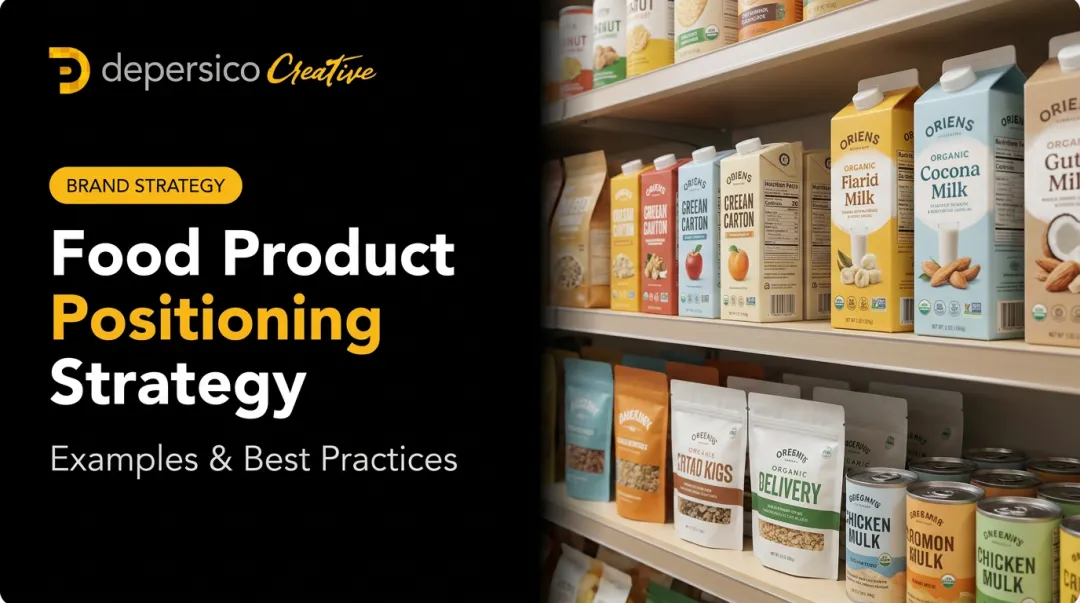
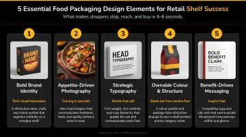
Why Packaging Is Your Most Powerful Branding Tool
Packaging is the silent salesperson. At the point of purchase, it has to do the job of a sales rep in two seconds or less: communicate what the product is, who it's for, why it's better, and why the shopper should pick it up right now.
For packaged food brands, packaging isn't just a container — it is the brand experience at the moment that matters most.
How Shoppers Actually Process a Shelf
Explorer Research notes that shoppers typically process only 3 elements on a package, while most packs contain 5 to 7. That means most of your packaging real estate is being ignored.
Visual hierarchy isn't optional. The dominant brand name, a compelling hero image, and one key benefit claim must do the heavy lifting — everything else is secondary. Packaging that fails to interrupt the visual scan within seconds simply doesn't get picked up.
What Effective Food Packaging Actually Requires
Getting those three elements right depends on decisions made long before the product hits the shelf:
- Material and structure signal quality instantly (a matte finish reads premium; a thin, flimsy bag reads discount)
- Color blocking needs to contrast against the competitive set on the actual shelf — not just against a white background
- Typography must be legible at shelf distance and carry the brand's personality
- Food photography or illustration drives appetite appeal more than any other single element; professional imagery measurably increases perceived quality
- Front-panel copy earns the pick-up with 5-10 carefully chosen words
Packaging Coherence Across a Product Line
If your brand has multiple SKUs, the packaging family must be visually consistent enough to own a shelf block while differentiated enough for shoppers to quickly identify individual products. Weak brand architecture kills sales even when the product is genuinely good.
DePersico Creative's SWIFI process (Strengths, Weaknesses, and Ideas For Improvement) evaluates packaging from a visual perception standpoint — comparing a product against its strongest competitors to identify what the current design communicates versus what it should communicate.
The assessment covers visual hierarchy, front-panel messaging speed, competitor contrast, and the cues that actually drive trial. It's particularly useful before committing to costly production investments.
When Sea Best needed to signal restaurant quality at retail, DePersico redesigned the packaging system across 34 SKUs by replacing a dark, dated color scheme with sunset imagery and a cream background, adding "restaurant quality" directly under the logo, and building a cohesive visual identity across new product lines and a custom trade show booth. Sea Best expanded from 9 to 34 products and grew distribution into new regions.
How to Build a Food Branding Strategy Step by Step
Step 1: Define Your Target Buyer and Their Decision Triggers
The foundation of any food branding strategy is a precise understanding of your customer: their demographics, shopping habits, and what genuinely motivates their food choices — health, convenience, indulgence, value, or ethics.
Without this clarity, every visual and verbal decision is guesswork. Know whether your buyer reads ingredient lists or responds to taste cues. Know whether they're shopping on autopilot or actively looking for something new. Their decision triggers determine everything downstream.
Step 2: Develop Your Unique Selling Proposition (USP)
Your USP must answer one clear question: Why should this shopper pick your product over every other option on this shelf?
The difference between a generic claim and a differentiating one is direct:
- Generic: "Great taste, great value"
- Differentiating: "The only protein bar with no added sugar made from three whole-food ingredients"
DePersico Creative's brand analysis process — starting with a SWIFI competitor audit — reveals the gaps in a category: what competitors aren't saying, what shoppers aren't getting, and where a new or repositioned brand can own a clear message.
Step 3: Create a Cohesive Visual Identity
Visual identity deliverables include your logo, color palette, typography system, and iconography or illustration style. These must work as a system, not as individual elements, and every choice should trace back to your target buyer and your USP.
Oatly is a strong example of a brand that carries a single visual system across packaging, retail, and digital. The Swedish oat milk brand's packaging — developed by Forsman & Bodenfors — turned the carton into advertising space, using a distinctive blue, brown, gray, and white palette with direct, conversational language.
The result: Oatly held a 53% market share in Sweden's alternative dairy non-milk category as of 2020, per its SEC F-1 filing.
Step 4: Design Packaging That Sells
Once brand identity is established, packaging design translates it into a retail-ready selling tool.
The front panel must communicate the brand story and key benefit in the first 2-3 seconds. Back and side panels deepen the story — building trust through certifications, sourcing claims, and social proof — while reinforcing brand voice throughout.
Professional food photography makes a measurable difference in perceived quality and appetite appeal. DePersico Creative operates a fully equipped test kitchen and photography studio, where food stylists prepare dishes from scratch and style them with props calibrated to the brand's positioning — gourmet to homestyle.
The team captures multiple angles for packaging, websites, and marketing materials, and clients receive full usage rights across all formats.
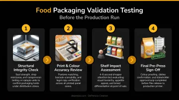
Step 5: Test, Get Feedback, and Refine
Once packaging is designed, validate it before committing to a full production run. Methods include:
- Shelf simulation tests — place new packaging next to competitors on a mock shelf and watch where eyes go
- A/B concept reads — quick exposure tests to measure which version communicates faster
- Mobile thumbnail tests — evaluate legibility in e-commerce contexts
- Small regional runs — real in-market data before a national rollout
Tropicana's 2009 redesign is the cautionary tale here: the brand replaced its iconic orange-with-straw imagery with a generic glass of juice. Consumer backlash was immediate. According to Packaging Digest, sales dropped 20% within two months before the original packaging was restored. Testing would have surfaced the problem before it became expensive.
DePersico Creative's approach includes shelf mocks, A versus B comparisons, and digital PDP tests — evaluating whether new systems improve shelf blocking, findability, and recognition speed before production commitments are made.
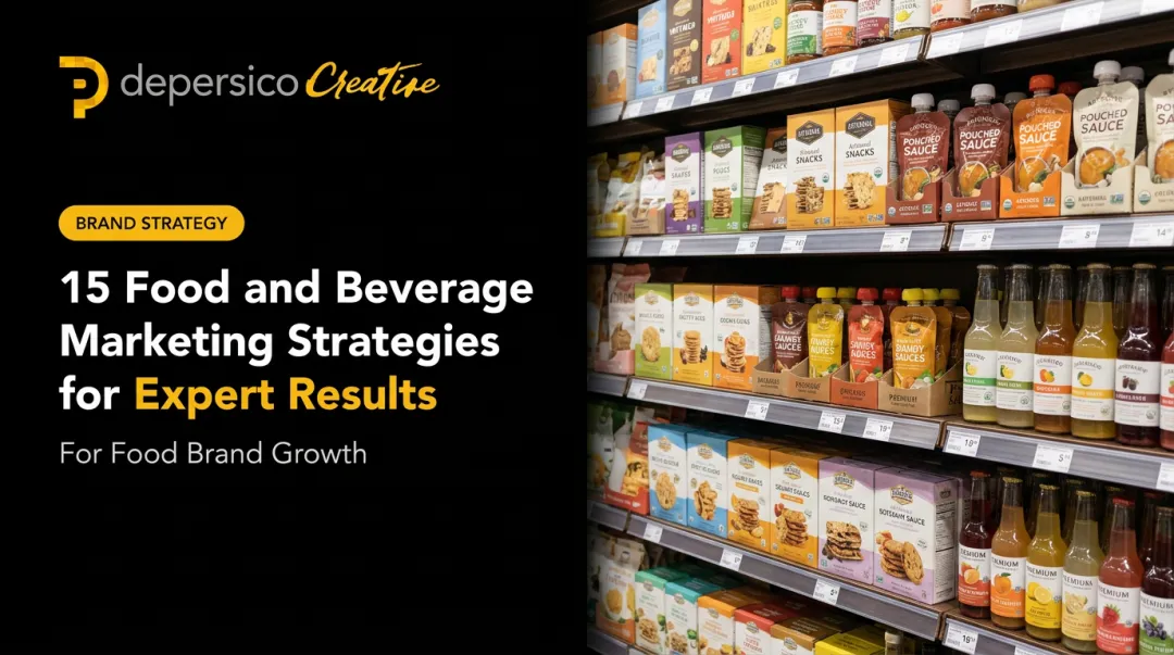
Promoting Your Food Brand Across Key Channels
Social Media
Instagram, TikTok, and Pinterest are the highest-performing platforms for food content because they're visual-first. But the numbers tell different stories by platform.
Dash Social's 1H 2025 benchmark reports Food and Beverage engagement rates of:
- TikTok: 3.7% — the strongest engagement channel for food brands
- Instagram: 0.3% — lower engagement, but still essential for visual brand presence
High-quality food photography, process videos, plating moments, and behind-the-scenes production content outperform branded graphics on both platforms.
Influencer and Food Blogger Partnerships
Micro-influencers — niche food bloggers, local foodies, category-specific creators — often outperform broad macro-influencers because their audiences are specifically interested in discovering new food products.
The ROI evidence is real. A WhiteWave Foods Silk influencer campaign measured by TapInfluence and Nielsen Catalina Solutions delivered 10% incremental sales lift among exposed consumers and $285 in incremental sales per 1,000 pageviews — generated by over 250 fitness and food content creators.
The most effective food influencer strategies combine product seeding, recipe collaboration, and authentic review content rather than scripted brand messaging.
Retail and Trade Event Presence
Food trade shows give emerging brands direct access to retail buyers, distributors, and press. Key events worth knowing:
- Summer Fancy Food Show (NYC, June 2026) — 8,000+ buyers, 2,500+ booths, 40+ categories
- Natural Products Expo West (Anaheim, March 2026) — 66,000+ attendees, 3,200+ exhibitors
- SIAL Paris (October 2026) — 8,000 exhibitors, 130 countries, 650 startups
At these events, your booth is your brand. DePersico Creative produces trade show systems for food brands, including:
- Booth graphics and pop-up displays
- Sell sheets and sample-tray branding
- Follow-up materials coordinated to your packaging identity
Every element is built to make the same impression on a buyer at a trade show that your product makes on a shopper at shelf.
Beyond trade shows, brands already in retail should note that in-store demos remain one of the highest-ROI channels for driving first-time trial.
Food Branding Examples Worth Studying
McCormick: The Power of Packaging Architecture at Scale
McCormick has maintained brand recognition across hundreds of SKUs through a disciplined packaging architecture: the distinctive label format, the use of yellow as a signature brand color, and clear product hierarchy that makes any McCormick product instantly recognizable whether it's shelved next to dozens of other spices.
What smaller brands can learn: a consistent visual system builds equity that compounds over time. You don't need to reinvent your packaging with every new product — you need a system that scales.
Chobani: Disrupting a Category Through Design
Chobani entered a commoditized category and used design to redefine it. When it launched in 2007 and grew to approximately $1.1 billion in net sales by 2013 (per its SEC S-1 filing), packaging was carrying real competitive weight on the shelf.
The 2017 redesign pushed that further: watercolor fruit illustrations replaced photographs, an off-white background replaced the clinical white of competitors, and a bolder font improved shelf findability. Dropping "Greek Yogurt" from under the brand name as Chobani expanded its portfolio was a positioning decision as much as a design one.
RXBAR: When Honesty Becomes a Brand
RXBAR's packaging pivot is one of the cleaner challenger-brand case studies in recent CPG history. The original RXBAR packaging looked like every other protein bar on shelf. The redesign, documented by Packaging World, put the entire ingredient list on the front panel — "3 Egg Whites. 6 Almonds. 4 Cashews. 2 Dates. No B.S." — and built the brand identity around radical transparency.
The result: Kellogg acquired RXBAR for $600 million in 2017, when the brand's expected annual net sales were approximately $120 million. Packaging wasn't the only factor, but it was the most visible expression of a positioning that resonated completely with its target buyer.
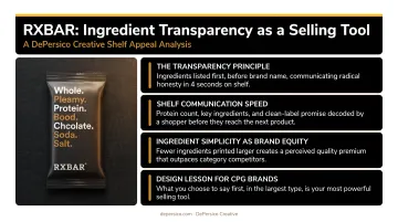
The takeaway for challenger brands: a limited budget is not the obstacle. A clear, honest story — one your specific buyer immediately recognizes as true — is what drives shelf performance and purchase decisions.
Key principles the RXBAR case study reinforces:
- Front-panel transparency can itself become a brand differentiator
- Ingredient simplicity is a positioning strategy, not just a formulation choice
- Design that reflects a clear point of view attracts buyers who share it
Frequently Asked Questions
What is food branding?
Food branding is the process of creating a distinct identity for a food product through visual design, packaging, and messaging, so consumers recognize, trust, and consistently choose it over competitors. That identity spans logo, color, brand story, and the copy on your front panel.
How does packaging design affect food sales?
Packaging is often the first and only brand touchpoint at the point of purchase. Packaging that clearly communicates quality, benefit, and brand personality increases shelf pick-up rates and drives first-time trial within seconds of a shopper noticing the product.
What are the most important elements of food brand identity?
The five foundational elements are logo, color palette, typography, brand voice, and packaging design. All five must function as a cohesive system — even a strong logo with inconsistent packaging still loses on shelf.
How do I know if my food brand needs a redesign?
Key signals include declining shelf performance, dated visual design, misalignment between the brand and its target buyer, or preparing to enter a new retail channel where current packaging doesn't hold up against competitors. A structured packaging assessment like DePersico Creative's SWIFI process can surface these gaps before committing to a full redesign.
What colors work best for food packaging?
Warm colors (red, orange, yellow) are the strongest for appetite stimulation and attention. Green is the default signal for natural, organic, and better-for-you positioning. The right answer depends on your product category, target buyer, and what your direct competitors are already using.
How long does it take to build a recognizable food brand?
Initial recognition typically requires 12–24 months of consistent activity across packaging, shelf presence, and marketing. Building deep consumer loyalty — the kind that drives automatic repurchase — takes several years of sustained brand equity work.