Introduction
A food brand's logo has one job at retail: stop a shopper in under six seconds. That's the window DePersico Creative consistently observes across shelf audits — four to six seconds before a consumer moves on, makes a choice, or reaches for a competitor. In a crowded grocery aisle, those seconds are the entire sales pitch.
What makes food logo design distinctly high-stakes is the simultaneous demands it carries. Unlike a tech company's mark or a service brand's identity, a food logo must trigger appetite, communicate trust, and create recognition — all at once, under fluorescent lighting, at arm's length.
The clearest signal for 2026: winning food logos feel personal, story-driven, and human. Not over-polished. Not generic. This article covers the five most relevant trends shaping food brand logo design, what's driving them, and what food companies should be thinking about next.
Key Takeaways
- Warm, handcrafted aesthetics — earthy tones, hand-drawn script, organic textures — lead food brand identity in 2026.
- Heritage cues like badge formats, stamp aesthetics, and founding-year references are strong purchase triggers for specialty food brands.
- Bold, appetite-activating color is replacing safe, muted palettes across snack, indulgent, and premium food categories.
- Scalability is non-negotiable: logos must hold up from a 2-inch jar label to an e-commerce thumbnail, which means clean simplicity with one ownable detail.
- Expressive brand mascots are back — built for emotional connection and built to work across packaging, social, and retail displays alike.
Warm, Handcrafted Authenticity
What It Looks Like on Shelf
This trend shows up in food branding as rounded letterforms, brushed or hand-drawn script, organic badge shapes, and subtle grain or paper textures on labels. Adobe's 2026 design trends identify "Organic and imperfect design" — including hand-rendered fonts and earthy textures — as one of the defining visual directions of the year. Canva frames 2026 as "Imperfect by Design," emphasizing tactile, human-feeling aesthetics over digital precision.
The palette for this trend runs toward oat, cream, terracotta, clay pink, sage, warm brown, and faded navy — colors that communicate craft before a shopper reads a single word. A strong example is Organic Valley's 2023 packaging refresh, which the brand described as "Nowstalgia" — modern illustrations that connect an idealized past with a contemporary present. The logo evolved to fit the new visual language, demonstrating how a handcrafted aesthetic extends from the mark itself across labels and social content.
Why Food Brands Specifically Benefit
Consumers have become skeptical of slick, over-produced food branding. A perfectly rendered, corporate-looking logo now carries an unintended signal: processed, mass-produced, and generic.
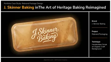
Hand-touched design cues signal the opposite: care, a real maker behind the product, and quality worth seeking out. DePersico Creative applies this through handwritten typography chosen to convey a homemade feel — not as decoration, but as a strategic brand signal.
Their J. Skinner® Baking rebrand put this directly to the test: an organic brown background with lowercase white script that appeared handwritten, communicating small-batch craft across danishes and sweet rolls. The result was a branded sales increase of 210–340% compared to average national sales.
This trend works especially well for:
- Bakeries and artisan baked goods
- Specialty condiments and sauces
- Organic CPG brands
- Premium frozen food products
- Small-batch pantry staples
Heritage & Provenance Storytelling
The Visual Language of Trust
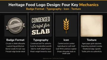
Heritage-driven food logos use circular or oval badge formats, arched text, postmark and stamp aesthetics, and etched iconography referencing farms, ingredients, or geography. Founding dates and geographic origin details are functional elements here — not decorative shorthand.
A 2025 study on heritage food packaging found that heritage elements enhanced brand preference, with verbal heritage cues increasing purchase intention for heritage products. Academic research consistently supports origin labeling as a driver of perceived value — GI and PDO/PGI labels show positive willingness-to-pay effects across food categories.
DePersico Creative's work with DaVinci pasta demonstrates this directly. The redesign leveraged the brand's Italian heritage through handwritten script modeled on Leonardo da Vinci's journals, authentic "Imported from Italy" lock-ups, and imagery of the Italian countryside. After five years of declining sales, that provenance storytelling helped revitalize the brand entirely.
Design Mechanics That Make It Work
A contained badge format is particularly effective for food brands because it works equally well on a jar, a bag, a box, and a digital storefront. The design requirements are:
- One-color execution — the logo should hold in a single ink
- Condensed serif or typewriter fonts — communicate authority and age without feeling ornate
- A hero icon — one image that communicates ingredient or origin in a single glance
- Slight distressed texture — makes the stamp or seal feel genuine, not digitally polished
Each of these mechanics only lands if the underlying details are real. The provenance elements must be ownable to the brand specifically — a founding year, an actual region, a genuine production method. Generic "rustic" cues that could belong to any company communicate nothing to shoppers who have seen the same worn-wood aesthetic on dozens of competing packages.
Bold, Appetite-Driven Color
Two Directions, One Objective
Color is the first purchase trigger a food logo deploys. In 2026, two dominant directions are emerging:
- Appetite-activating hues: deep reds, warm oranges, terracotta, and burnt sienna for indulgent and snack brands
- Jewel-tone premiumization: midnight green, burgundy, and deep indigo for elevated positioning
Research published in 2024 found that warm-colored packaging increased purchase intention for indulgent foods through perceived fluency — the warmth of the color matched the warmth of the eating experience. Cool colors like green and blue performed better for health-oriented products tied to virtue and restraint.
A separate 2024 study found black packaging was perceived as significantly more premium in an organic pasta context — a clear signal that dark, saturated tones are earning their place beyond luxury beverage and confectionery.
A real example of bold color in action: Dieline covered Wild Oats' 2026 redesign, noting that the brand's "screaming red" rebrand deliberately contrasted with natural-food competitors clustered around green, tan, and brown — creating immediate shelf differentiation.
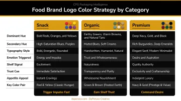
Practical Color Rules for Food Logos
| Brand Category | Color Direction | Strategic Goal |
|---|---|---|
| Snack / Indulgent | Rich reds, oranges, warm yellows | Appetite activation, impulse purchase |
| Organic / Health | Sage, oat, desaturated earth tones | Health, naturalness, trust |
| Premium / Specialty | Deep jewel tones, black | Price justification, sophistication |
Regardless of category, the table above points to the same discipline: restraint. Two to three colors maximum in a food logo. A strong accent paired with a neutral creates shelf differentiation without visual chaos. DePersico Creative's work with Sea Best used a consistent pale yellow and crimson system across 34 product varieties — proof that a contained color system scales cleanly across a large portfolio.
One constraint every food brand must address: the logo must hold in monochrome. Embossing, single-ink labels, and ink stamps are production realities. The boldest color execution is meaningless if the underlying form can't carry the brand in black and white.
Clean Simplicity That Scales Across Every Touchpoint
The Scalability Problem Is Real
A food brand logo in 2026 must perform at:
- A 2-inch jar label in a refrigerated case
- A 16px favicon
- An e-commerce thumbnail on Amazon
- A social media profile icon
- A truck wrap at highway speed
That's an extraordinary range of contexts, and most logos weren't designed with all of them in mind. NIQ reported in 2024 that in-store product selections are typically made in less than six seconds — and Explorer Research found packaging often has only one to two seconds to engage shoppers before they move on. Any logo that relies on intricate detail will fail at least half those touchpoints.
The answer isn't a generic, stripped-down mark. It's a clean form with one ownable, unexpected detail (what designers call the "Simple Twist" approach) that drives brand recall without adding complexity that breaks down at small sizes.
What "Ownable Detail" Means in Practice
In food branding, this might be:
- A smart negative-space element suggesting an ingredient (a leaf hidden in a letter, a spoon embedded in a wordmark)
- A single line detail that references the brand's founding story
- A geometric shorthand that instantly communicates the product category
DePersico Creative builds logos with what they describe as "signature elements" : a color block, a distinctive framing device, or an illustration style that becomes uniquely recognizable across SKUs and pack sizes. Their DaVinci pasta work used handwritten script as that signature element, connecting the brand's Italian heritage to a single, scalable typographic detail that worked on everything from 16oz boxes to trade show displays.
That DaVinci example reflects what the research bears out: simpler logos aid short-term recognition speed, while logos with a memorable distinctive element build stronger recall over time with repeated exposure. For food brands, the practical balance is keeping the form simple while ensuring there's at least one detail worth remembering.
Expressive Food Mascots & Brand Characters
Why Characters Are Back
In a crowded, omnichannel market, characters create emotional attachment faster than wordmarks can. Adobe's 2026 design trends point toward warm, personal, human-centered visual language — and a well-designed mascot is the most direct expression of that direction.
The mascots returning to food packaging are not the over-rendered, committee-approved characters of past decades. They're simplified, hand-drawn, expressive — built to work at favicon size and on a branded bag simultaneously.
What a Modern Food Brand Mascot Looks Like
- Bold, simplified silhouette — readable at any size in under a second
- Two to three flat colors — no gradients, no shading that disappears when scaled down
- Minimal but expressive features — enough personality to communicate the brand, not enough detail to confuse at small sizes
- One clear personality signal — playful, caring, bold, or quirky — not all of the above at once
A 2014 review found children's recognition of popular food-brand characters ranged from 60% to 90%, and research consistently shows that childhood exposure to mascots creates long-term positive feelings toward food brands that transfer to line extensions.
DePersico Creative designed Fisher the Sea Best® mascot as part of a comprehensive brand refresh for the frozen seafood line. The character added playfulness to the brand's identity while scaling across packaging for 34 product varieties, trade show materials, and truck graphics — exactly the kind of multi-touchpoint versatility a modern food mascot requires.
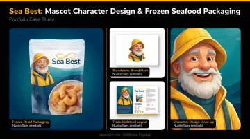
That versatility points to where mascots deliver the most value: family-focused brands and categories where packaging all looks the same. The character has to earn its place — simple enough to scale, distinctive enough to own, and grounded in the brand's actual story.
A generic mascot adds shelf clutter, not shelf presence. Without a clear connection to what the brand stands for, it undermines premium positioning rather than supporting it.
What's Driving These Trends — And What's Coming Next
Two Forces in Tension
The five trends above aren't random design cycles. They're responses to two specific pressures converging in the food industry right now.
Consumer demand for authenticity and transparency is reshaping purchase behavior. The FMI and NIQ transparency research found that shoppers calling transparency "very or extremely important" rose from 69% in 2018 to 76% in 2023. Craft, origin, and handcrafted cues aren't trend-chasing — they're visual answers to what shoppers need to see before they'll trust a brand enough to buy.
**The omnichannel expansion of food retail** is the second pressure. Online food sales jumped nearly 19% in 2025 and contributed close to 75% of total grocery dollar growth. The market is on track to reach $452 billion by 2028, and US eGrocery sales alone hit a record $12.7 billion in December 2025 — up 32% year-over-year.
A logo designed only for the physical shelf is now functionally incomplete.
DePersico Creative has spent over 45 years focused exclusively on food and beverage brand design. These tensions show up in every shelf audit and brand analysis — and they're why food logo design requires specialized strategic thinking, not general design trends applied after the fact.
Key Market Drivers at a Glance
- The 6-second shelf decision — purchase decisions happen before conscious evaluation, creating pressure for logos that trigger appetite and recognition instantly
- Omnichannel format demands — each channel (physical retail, Amazon, DTC, meal kits) requires logos that perform at different scales and contexts
- The claim gap — NIQ found that 84% of brands fail to claim at least one of their top three most-searched product attributes on digital or physical packaging, making visual brand identity even more critical as a trust signal
What's Coming Next
In the next one to three years, food brand logos will increasingly need to function within animated and motion contexts: social media, digital menus, delivery app storefronts. The static mark will become one component of a broader visual identity system.
Brands investing now in flexible, human-feeling logo systems — built on clean forms, ownable details, and authentic story — will adapt more easily than brands whose identity depends on complexity that can't scale down, speed up, or animate.
Frequently Asked Questions
What makes food brand logo design different from logos in other industries?
Food logos must trigger appetite, trust, and recognition simultaneously — and do it in under six seconds on a retail shelf or screen. That requires specific knowledge of food color psychology, packaging constraints, and consumer purchase behavior that general logo design principles don't cover.
How often should a food brand update or refresh its logo?
There's no fixed rule. Audit your logo when entering new markets, when consumer research signals it feels dated, or when a product repositioning creates a mismatch. Minor refreshes every five to seven years are common; full rebrands are rarer and higher-stakes.
What colors work best for food brand logos in 2026?
Appetite-activating warm hues (reds, oranges, terracotta) for snack and indulgent brands; earthy, desaturated naturals (oat, sage, clay) for organic and health-positioned brands; and rich jewel tones (deep green, burgundy, indigo) for premium positioning. Color choice must align with the specific product category and target consumer.
Should food brands use mascots in their logos?
Mascots work well for brands targeting families or younger consumers, but only when the character is simple enough to scale, genuinely tied to the brand's story, and distinctive enough to own. A poorly executed mascot can undermine premium positioning or feel generic.
How do logo design trends affect food packaging design?
A food brand's logo anchors its entire packaging system: color palette, typography, and visual tone all follow from it. Adopting a new logo direction without updating the broader packaging creates inconsistency that confuses shoppers. Logo and packaging decisions should always be evaluated together.
Can a small food startup apply the same logo trends as a national food brand?
Yes — 2026 trends particularly favor small and independent food brands. Warm authenticity, provenance storytelling, and clean simplicity reward genuine brand stories over the resources required for glossy, over-produced design.