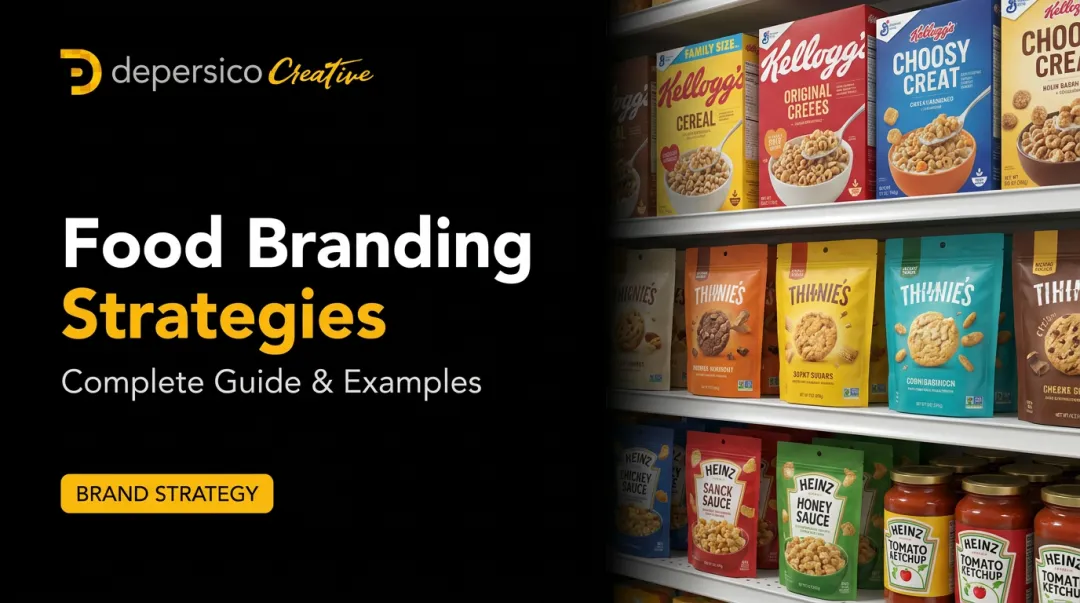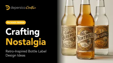
Retro-inspired bottle labels work because they bypass rational decision-making and speak directly to emotional memory. Before a shopper reads a single word, a vintage label communicates craft, authenticity, and quality through visual shorthand built up over decades of cultural association.
This post covers what actually makes nostalgic packaging effective as a selling tool, five specific design eras worth drawing from, the specific elements that bring vintage labels to life, and how to match the right aesthetic to your product and brand story.
Key Takeaways
- Nostalgia reduces price resistance and accelerates purchase decisions , backed by peer-reviewed consumer research
- 82% of shopping decisions happen in-store, making your label your most important salesperson
- Five retro eras map to distinct product categories — Art Deco, 1950s Americana, Pop Art, 1970s earthy, and Victorian
- Retro design only works when it's anchored in something true about the brand — otherwise it reads as costume
- Regulatory compliance must be designed in from the start, not added at the end
Why Nostalgia Is a Powerful Selling Tool in Bottle Label Design
Most packaging conversations focus on what's modern, trend-forward, and visually fresh. Nostalgia marketing works from the opposite direction — it wins by feeling familiar.
Research published in the Journal of Consumer Research across six experiments found that nostalgia decreases consumers' desire for money, lowering the psychological resistance to spending. In practical terms: a label that triggers nostalgic associations makes a shopper more willing to pay for the product. That's a meaningful lever in a category where price sensitivity runs high.
The Shelf Reality
The stakes at shelf level are high. POPAI's Mass Merchant Shopper Engagement Study found that 82% of shopping decisions are made in-store, with unplanned purchases climbing from 55% to 62%. Your label isn't decoration — it's a conversion asset doing sales work in real time.
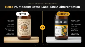
Retro labels create shelf differentiation through contrast. When every competitor is running clean gradients and minimalist type, a label with hand-drawn illustration, aged color palettes, and ornate typography stops the eye for a different reason. The contrast is the hook.
Why Food and Beverage Is the Natural Fit
Eating and drinking are already nostalgic acts. Flavors, smells, and textures activate memory more directly than almost any other sensory experience. A craft soda in a vintage-styled glass bottle with a hand-lettered label doesn't just signal "artisan" — it activates the memory of what soda used to taste like before everything came in plastic.
Research in the British Food Journal found that traditional and homemade label claims carry a double edge:
- Consumers read them as signals of fewer additives and higher quality
- Those same claims read as marketing noise when the product doesn't back them up
Nostalgia creates expectation. The product has to meet it.
5 Retro Design Eras to Inspire Your Bottle Label
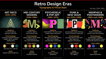
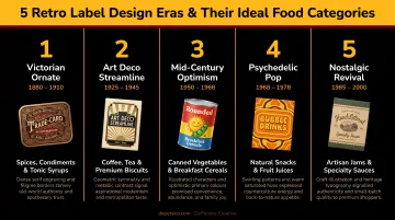
1920s Art Deco — Sleek, Symmetrical, and Sophisticated
Art Deco is defined by geometric precision: symmetrical layouts, bold sans-serif or stylized letterforms, sunburst and fan-shaped motifs, and metallic accents in gold, silver, and black. According to the Letterform Archive's documentation of Art Deco graphic design, the style pairs streamlined aesthetics with decorative restraint — which is exactly what makes it work for premium positioning.
Best for: Premium sparkling water, specialty teas, upscale condiments, and non-alcoholic sparkling beverages
- Use gold foil or gloss spot finishes to reinforce the inherent glamour
- Limit your palette to two or three colors — refinement comes from restraint, not richness
- Symmetrical label layouts reinforce the era's sense of order and authority
- The Theory of Tea uses Art Deco whimsy and botanical illustration in their tea packaging as a strong current example
1950s Diner Americana — Warm, Playful, and Instantly Familiar
The 1950s supermarket era produced a distinct visual vocabulary: pastel color palettes (mint green, coral pink, cream, baby blue), rounded script and hand-lettered fonts, and illustrations that evoke soda fountains and neighborhood diners. The overall feeling is approachable and warm rather than premium and distant.
Best for: Craft sodas, hot sauces, condiments, dessert mixes, and products positioned around comfort or "old-fashioned" quality
This aesthetic pairs exceptionally well with era-appropriate copy — what DePersico Creative calls creative linguistics. Phrases like "ice cold," "original recipe," and "since [year]" don't just describe the product; they place it in a specific cultural moment that triggers familiarity. Boylan Bottling, a craft soda brand operating since 1891, uses exactly this approach — their "made in the USA with pure cane sugar" positioning anchors the visual nostalgia in product reality.
Application tips for this era:
- Lean into hand-lettered or script typography over geometric sans-serifs
- Coral, cream, and mint green read "retro" without requiring illustration
- Era-specific copy claims ("original recipe," "since [year]") do more positioning work than most visual elements
1960s Pop Art — Bold, Energetic, and Eye-Catching
Pop Art borrowed directly from comic books, print advertising, and mass media. As described by Tate's art terms documentation, the style is deliberately popular, mass-produced, witty, and gimmicky — those qualities translate well to packaging that prioritizes personality over prestige.
Visual markers: Bright primary colors, halftone dot patterns, speech bubbles, oversized bold typography, comic-style illustration
Best for: Snack foods, craft sodas, energetic beverage lines, youth-oriented products
One important warning: Pop Art labels can overwhelm required product information if the visual energy isn't managed. Bold doesn't mean chaotic — keep a clear hierarchy so the brand name and product descriptor land first, with the graphic energy supporting rather than swamping them.
1970s Groovy and Earthy — Warm, Textured, and Natural
The 1970s design aesthetic combines warm earthy tones (burnt orange, olive, mustard yellow) with vibrant purples and swirling organic patterns. The era's typography runs toward bubbly, hand-drawn letterforms with an expressive, slightly imperfect quality.
This era maps directly onto the natural and organic food category — projected at $320 billion in 2024 according to SPINS data reported by FoodNavigator — which is why the visual language keeps showing up on shelves.
Best for: Organic beverages, functional sodas, natural sauces, artisan foods, wellness products
OLIPOP's packaging redesign — described by PRINT Magazine as inspired by the late 1960s and 1970s with expressive icons — is one of the clearest current examples of this era working at scale for a functional beverage brand.
Material note: Uncoated or matte label finishes reinforce the handcrafted feel. The warm earthy palette photographs well against wood, linen, and stone — surfaces that show up constantly in food and beverage content on Instagram and Pinterest, extending the label's reach well beyond the shelf.
Victorian and Apothecary (1880s–1910s) — Ornate, Authoritative, and Rich in Craft
Victorian label design is the most information-dense of the five eras. Visual hallmarks include dense serif typography with elaborate flourishes, decorative borders and scrollwork, sepia and muted earth tones, engraving-style illustrations, and formal language that signals heritage and expertise.
The Hagley Museum documents that chromolithography, introduced in the U.S. in 1840, enabled the elaborate colorful imagery that defined this era of commercial packaging.
Best for: Craft bitters, botanical soft drinks, tinctures, specialty vinegars, artisan sauces, herbal teas
- Include founding year, place of origin, or formal product descriptors ("Est. 1887," "Small Batch," "Hand Pressed") within the label itself
- Fentimans' botanically brewed soft drinks demonstrate how Victorian heritage cues translate into premium retail positioning for non-alcoholic beverages
- Avoid pharmaceutical-sounding claims — the apothecary aesthetic works beautifully until it accidentally implies medicinal benefits
Key Design Elements That Bring Retro Labels to Life
Typography
Font choice is the fastest signal of era. A few general mappings:
| Era | Font Direction |
|---|---|
| Victorian | Ornate serifs with flourishes, formal script |
| Art Deco | Bold geometric sans-serifs, stylized display faces |
| 1950s | Rounded hand-lettered scripts |
| 1960s Pop Art | Bold italicized display, comic-style lettering |
| 1970s | Bubbly rounded fonts, expressive hand-drawn type |
DePersico Creative's guidance on label typography is clear: limit designs to two or three complementary typefaces maximum. Combining multiple font styles creates visual clutter and sends mixed messages to shoppers making split-second decisions.
The brand name should be the largest and boldest element, with supporting information scaling down from there. Every typeface choice must remain legible at actual label scale — no vintage script that looks beautiful at 200% zoom but disappears on the shelf.
Color Palette
Retro palettes are more restricted than modern ones — muted tones, pastels, and earthy hues define each era. A few rules that hold across most vintage styles:
- Cap your primary label at three colors maximum
- Slightly desaturate otherwise-bright colors to achieve an authentic "time-worn" quality
- Choose matte or uncoated finishes for Victorian, 1970s, and natural-positioned products — research published in Food Quality and Preference found glossy packaging can imply higher fat content and lower quality in certain categories
Illustration Style
Hand-drawn or engraving-style illustrations signal "vintage" faster than any other element. Key illustration types by era:
- Line art and etching: Victorian and apothecary
- Woodblock-style prints: Victorian and early 1900s
- Halftone dot patterns: 1960s Pop Art
- Loose, organic illustration: 1970s earthy aesthetic
- Clean geometric decorative motifs: Art Deco
DePersico Creative handles custom illustration in-house alongside packaging design, which matters for label projects where illustration style and typography need to be developed as an integrated system rather than separately sourced assets.
White Space and Visual Hierarchy
Over-decorating is the most common mistake in retro label design. Even the most ornate Victorian or Art Deco labels use strong visual hierarchy — a clear brand name, a secondary product descriptor, and a detail layer that the eye reaches only after the primary read.
The practical rule: every label should be readable at three to five feet. If your brand name requires the consumer to pick up the bottle to read it, the label has failed its first job.
How to Choose the Right Retro Era for Your Brand
The right era should feel like a natural extension of your product's origin story, not an aesthetic borrowed because it's trending.
Category pairings that work:
| Era | Best Product Fit |
|---|---|
| Art Deco | Premium sparkling water, specialty teas, upscale condiments |
| 1950s Americana | Craft sodas, hot sauces, comfort food and beverage |
| 1960s Pop Art | Snack foods, playful beverages, youth-oriented products |
| 1970s Earthy | Organic beverages, functional drinks, natural sauces |
| Victorian/Apothecary | Craft bitters, botanical sodas, specialty ingredients |
The "Costume" Trap
Mismatching era to product confuses consumers. Retro design only works when it's anchored in something true about the brand — a founding year, a regional origin, a family recipe, a production method.
A craft soda brand that uses Victorian apothecary aesthetics because it looks sophisticated, but was founded three years ago with no botanical heritage, is wearing a costume. The nostalgia reads as hollow because there's nothing behind it.
A brand that has genuinely been making hot sauce with a family recipe since 1963 can use 1960s visual language as character rather than decoration.
Before choosing a visual era, identify the authentic story. That story determines which era's typography, color palette, and illustration style belong on your label.
Balancing Vintage Aesthetics with Modern Label Requirements
Retro design creates a practical challenge: FDA regulations require a mandatory set of label elements that are distinctly modern in their requirements. These include:
- Statement of identity
- Net quantity of contents
- Nutrition Facts panel
- Ingredient list
- Major allergen source disclosure
- Manufacturer name and place of business
The solution is to design compliance in from the start — not bolt it on at the end. Plan a designated compliance zone in the label layout that uses clean, legible typography. Required information must meet FDA type-size requirements regardless of how ornate the decorative design is. A Victorian flourish border doesn't exempt the ingredient list from legibility standards.
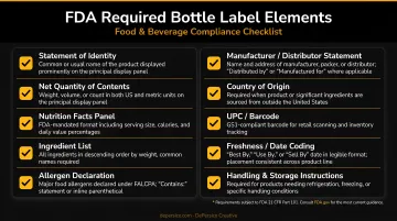
DePersico Creative's label design work specifically addresses this balance — their labels carry front-panel visual appeal while satisfying FDA Nutrition Facts panel rules (21 CFR 101.9), allergen disclosure requirements, and other mandatory elements. Compliance requirements are woven into the design from the first concept sketch, not reconciled at the end.
Photography follows the same principle. Most retro eras relied on illustration rather than product photography, so when food photography does appear alongside vintage label aesthetics, style it to match the era — warm, slightly muted tones rather than the high-saturation, clinical look of modern CPG photography.
Making Retro Work as a Strategic Brand Tool
Nostalgia on a bottle label is only as powerful as the strategy behind it. A label that looks authentically vintage but fails to communicate what the product is, who it's for, and why it's worth buying has missed the point.
The most effective retro-inspired labels are engineered to inspire trial within seconds. Every element — the era, the palette, the typography, the finish — should be chosen because it serves the brand's consumer connection goal.
The Strategic Foundation
NIQ research on packaging redesigns is unambiguous: 9 out of 10 redesigns fail to make a meaningful difference. The ones that work — generating an average 5.5% lift in forecasted revenue — are built on evidence rather than aesthetics.
A structured visual perception assessment changes that outcome. DePersico Creative's SWIFI process (Strengths, Weaknesses, and Ideas For Improvement) starts by analyzing what a label currently communicates, how it performs against direct competitors on shelf, and where the gap between consumer expectation and brand delivery exists.
That foundation prevents brands from investing in a retro aesthetic that looks great in a design presentation but stalls at retail.
The SWIFI process answers the questions that matter before any design direction is chosen: What is the product doing well visually? What's causing shoppers to overlook it? What would a unique, compelling value proposition look and sound like for this specific category and consumer?
Consistency Across Touchpoints
A retro label that exists only on the bottle creates a fractured brand experience. The nostalgic story needs to carry through outer packaging, e-commerce imagery, sell sheets, and social content — otherwise the aesthetic feels accidental rather than intentional.
DePersico Creative extends design concepts across every consumer touchpoint on every project:
- The bottle label and outer packaging
- Sell sheets for retail buyers
- Trade show and POS materials
- E-commerce thumbnail imagery
Consistent brand guidelines govern how the palette, typography, and illustration style appear across each format — so the retro story reads as intentional identity, not a one-off design decision.
Frequently Asked Questions
What makes a good back-of-bottle label design?
A strong back label uses clear visual hierarchy to present required regulatory information — ingredients, nutrition facts, net weight — alongside brand voice copy. It should complement the front label's aesthetic without competing with it, keeping fonts legible and information organized into distinct zones.
What are the 4 types of labels?
The four common label types are pressure-sensitive (self-adhesive), heat-applied (shrink sleeve), glue-applied, and in-mold labels. For craft and vintage bottle designs, pressure-sensitive labels on paper or textured stock are the most common choice — they support matte finishes and paper-grain substrates that reinforce handcrafted aesthetics.
How do I choose the right retro era for my bottle label?
Match the era to your product story, target audience, and brand personality. Victorian works for heritage and craft positioning; 1950s Americana suits approachable comfort products; Art Deco fits premium lines. Authentic brand narrative should drive the choice — not just an era that photographs well.
Can retro-inspired labels work for modern food and beverage products?
Yes, across virtually every food and beverage category. The vintage aesthetic needs to signal something true about the product — craftsmanship, heritage, natural ingredients — rather than serve as pure decoration. That authenticity is what turns a retro label into a shelf performer instead of a novelty.
What fonts work best for vintage bottle label designs?
Match font categories to the era you're referencing:
- Victorian: Ornate serifs and flourish-heavy script faces
- 1950s: Rounded, hand-lettered scripts
- Pop Art / 1970s: Bold, italicized display fonts
- Art Deco: Clean geometric serifs or sans-serifs
Regardless of style, legibility at label scale is essential — if it doesn't read clearly on the actual bottle, it doesn't belong on the label.