Bad food photography is one of the most common and fixable reasons food brands underperform — on shelf and online. Most problems trace back to the same recurring mistakes: poor lighting, wrong angles, weak styling, cluttered scenes, and heavy-handed editing. The good news is these are diagnosable, predictable, and correctable.
This article breaks down exactly what's going wrong in your photos, how to fix it step by step, and when DIY stops being an option.
Key Takeaways
- Bad food photos almost always trace back to five fixable mistakes: lighting, angle, styling, background, and over-editing
- Most mistakes are fixable without expensive equipment — but they require deliberate decisions, not just pointing and shooting
- Fix in this sequence: lighting first, then composition, then styling, then editing
- For product packaging, retail launches, or rebranding, weak photography costs more than it saves — poor visuals lose shelf placement and buyer confidence
Why Bad Food Photography Costs More Than You Think
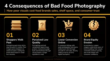
Photography is not decoration for food brands — it is a conversion tool. Shoppers decide whether to pick up a product in seconds based almost entirely on visual cues.
NIQ reports that shoppers look at a product for only 13 seconds before making a purchase decision, with packaging directly influencing attention, perception, and conversion at that moment. A peer-reviewed packaging study also found that 72% of consumers say packaging plays a key role in their purchase decision, with the majority of purchase decisions occurring at the point of sale.
When photography fails, the consequences are direct and measurable:
- Lost trial — shoppers don't pick up a product they can't visually connect with
- Weak shelf appeal — the product disappears against competitors with stronger imagery
- Poor e-commerce performance — product pages with weak imagery get scrolled past
- Difficulty entering retail — buyers and distributors evaluate packaging before they evaluate the product inside
Our SWIFI brand analysis, a visual perception assessment we run at the start of most client engagements, frequently surfaces weak photography as a primary weakness. The pattern is consistent: imagery that doesn't convey quality, fails to create appetite appeal, or simply gets lost next to competitors on shelf.
The Sea Best® result: Consumers were passing the product in the grocery aisle because the packaging wasn't communicating quality. After we photographed 34 varieties with restaurant-quality shots against bright, clean backgrounds, Sea Best® expanded its product line and secured distribution in the Northeast.
The Most Common Reasons Your Food Photos Look Bad
Most food photography failures fall into predictable categories. Once you name them, they're far easier to fix.
Lighting Is Doing More Harm Than You Realize
Harsh overhead indoor lighting or mixed light sources (window plus fluorescent overhead, for example) flatten texture, create unnatural bright spots, and make food look plastic. ICE notes that fluorescent lighting in particular can cast yellow or blue tones that make food look sickly, while B&H confirms that front lighting often makes food appear flat, with side or rear lighting preferred for creating depth.
Diffused side or rear light preserves the texture, warmth, and shadow that make food look real and craveable. This is the single most impactful change most food photographers can make.
The Shooting Angle Doesn't Match the Food
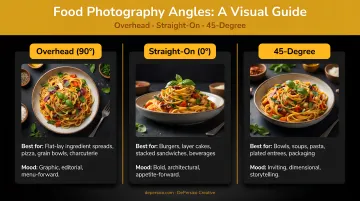
Every food has a best side. A burger photographed from overhead looks like a flat bun. A smoothie bowl shot straight-on loses its entire visual story. ICE documents three standard angles that professional food photographers use:
- Overhead (90°) — flat dishes, bowls, boards, pizzas, anything where the top carries the visual interest
- Straight-on (0°) — stacked and layered foods where height and structure matter: burgers, sandwiches, cakes, drinks
- 45-degree — the most versatile angle; works for most plated dishes and mirrors how people naturally see food at a table
For packaging specifically, the angle has one job: communicate the product's key visual selling point before a shopper moves on.
Food Styling Is Absent or Accidental
Poorly plated food — drooping garnishes, smeared sauces, uneven portions, haphazard arrangement — reads as careless even when the food itself is excellent. Viewers respond to presentation before they read a single word.
A neutral, unstaged presentation is a missed opportunity. Intentional styling creates a clear focal point, conveys texture and freshness, and gives the viewer a reason to want the food.
A few principles that work:
- Odd numbers of elements feel more natural than even
- Height and dimension add visual interest
- Sauce drizzles and glossy finishes catch light and signal appetite appeal
The Background and Props Compete With the Food
Loud patterns, neon props, or overly busy backgrounds pull the viewer's eye away from the food itself. Every element in the frame should serve the story of the dish — not distract from it.
The opposite problem exists too: a completely empty background can make product shots feel sterile and disconnected from any eating occasion. The goal is contextual simplicity — a surface and background that frame the food, not fight it.
Over-Editing Kills Authenticity
Heavy filters, oversaturated reds and oranges, or aggressive sharpening make food look artificial. The FTC has established that misleading product imagery creates legal exposure, and consumers notice the gap anyway. When an image doesn't match what's actually in the package, trust erodes before the product is ever tasted.
Good editing is nearly invisible: white balance correction, subtle exposure and shadow adjustments, selective sharpening on the food subject. Ask one question: does it look like the food at its most appetizing, or does it look like a heavily processed photo of food? That answer tells you everything.
How to Fix Your Food Photography: A Step-by-Step Approach
Trying to improve food photography without a clear sequence leads to guesswork. Solve each variable before introducing the next.
Step 1: Solve the Light Before Anything Else
The first decision in any setup should be light source and direction. A large window with diffused natural light positioned to the side or rear of the food eliminates most flatness and harshness problems. Avoid direct overhead or front-facing light.
When natural light isn't available:
- Use a large softbox or LED panel with a diffuser
- Position it at a 45-degree angle to the food
- Never mix light sources — window light plus overhead fluorescent creates color casts that are difficult to fix in editing
Step 2: Choose the Right Angle for the Food Type
Match the angle to the food's most appetizing feature:
| Food Type | Best Angle | Why |
|---|---|---|
| Bowls, boards, flatbreads, pizza | Overhead (90°) | Top communicates toppings and arrangement |
| Burgers, sandwiches, cakes, drinks | Straight-on (0°) | Layers and height carry the visual story |
| Plated dishes, casseroles, pasta | 45-degree | Shows both top and front; feels natural |
For brand packaging, the angle must convey the product's key visual selling point in the first glance. Many brands choose the wrong angle here and end up with a hero shot that looks polished but fails to communicate what makes the product worth buying.
Step 3: Style the Food Intentionally Before You Shoot
Food styling is about presenting the best, most honest version of the dish:
- Choose the freshest, most visually intact ingredients
- Plate with a clear focal point — one element the eye lands on first
- Add garnishes that reflect the dish's actual flavors
- Remove anything that looks accidental: drips in the wrong place, wilted herbs, uneven portions
Height and dimension add visual interest. Sauce drizzles and glossy textures catch light. Intentional imperfections — a slight asymmetry, a natural crumb — can make food feel more authentic and relatable.
Step 4: Build the Scene Around the Food, Not the Props
Select a surface texture and background tone that complements the food's colors without competing. Test the scene with one simple question: does every element in the frame help the viewer understand what the food is and why they'd want it?
Negative space is a legitimate styling tool. It focuses attention on the food and communicates premium positioning more effectively than a crowded scene.
Add only props that reinforce the eating occasion or ingredient story:
- A cutting board or linen napkin to ground the scene
- Fresh herbs or raw ingredients that echo what's in the dish
- Contextual details that make the food feel like part of a real moment, not a studio exercise
Step 5: Edit for Enhancement, Not Transformation
Edit in this sequence:
- White balance — eliminate color casts from the lighting setup
- Exposure and shadows — subtle adjustments only; preserve texture in highlights
- Selective sharpening — on the food subject, not the whole frame
- Saturation — adjust minimally; oversaturating reds and oranges is the most common mistake
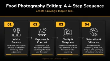
Avoid preset filters entirely. The goal is a final image that looks like the food at its most appetizing — not a version of food that's been processed into something unrecognizable.
Mistakes Even Experienced Photographers Still Make
Even with a solid process, a few common errors slip through:
- Skipping the lens check. A smudged or greasy lens is one of the most common causes of soft, hazy, low-contrast images — especially on smartphones. Wipe the lens before every shoot.
- Shooting for one context and using it everywhere. A lighting setup and angle that work beautifully for Instagram may perform poorly on packaging or e-commerce listings, where the image must function at a small size against competitor products. Let the final use case define the brief before you set up a single light.
- Treating the food as a given. The camera, the angle, and the edit can only work with what's in the frame. If the food looks cold, dry, or poorly plated, no technical skill recovers the image. Check plating, temperature cues, and garnish before the camera comes out.
When to Fix It Yourself vs. Hire a Professional Food Photographer
The DIY-versus-professional decision isn't just about budget — it's about stakes. Where the image will live, and what it needs to communicate, should drive the choice.
When DIY Is Acceptable
DIY food photography is a reasonable approach for:
- Social media content and organic posts
- Internal presentations or early product testing
- Small-scale direct-to-consumer marketing where speed matters more than perfection
- Content that will live briefly and isn't tied to a retail shelf
With the right lighting setup and the fixes outlined above, a smartphone produces serviceable images for these contexts.
When Professional Photography Is Non-Negotiable
For product packaging, national retail distribution, major e-commerce listings, and rebrand campaigns, DIY photography introduces risk that far outweighs any cost savings. At this level, images must:
- Perform against professionally photographed competitors on shelf
- Meet retailer and print production standards (the GS1 Product Image Specification Standard requires, among other things, retouching that is undetectable at 100% magnification and precise product framing)
- Communicate brand quality in a fraction of a second
- Function at thumbnail size on digital shelves and at large format on packaging and trade materials
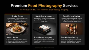
DePersico Creative's approach reflects this reality. Their setup — a working test kitchen, an in-house food styling team, and photographers capturing multiple angles — exists because packaging photography demands coordination that a standalone shoot can't provide. Every image ties back to brand strategy and functions within the packaging architecture, not just as a standalone shot.
The J. Skinner® pastry brand, for example, used professional food photography as part of a packaging redesign that resulted in double the growth of any other top-10 bakery brand in the category.
What to Look for in a Professional Food Photography Partner
Not all food photographers specialize in commercial or brand work. For packaging and retail, look for:
- Retail shelf experience — photographers who understand CPG context, not just editorial or social food styling
- Brand strategy alignment — photography choices should reflect competitive positioning and packaging hierarchy, not be made in a vacuum
- Technical fluency with production standards — packaging has specific output requirements; your partner needs to know them cold
- Integrated capabilities — working with one team across brand analysis, package design, and photography keeps visual elements cohesive and cuts down on vendor coordination overhead
Frequently Asked Questions
What are some common mistakes in food photography?
The most impactful errors are using harsh or mixed lighting, shooting from the wrong angle for the food type, skipping food styling, and over-editing. Most mistakes come from not treating lighting and composition as deliberate choices — the camera captures what's there, good or bad.
What is the best lighting for food photography?
Soft, diffused natural light from a side or rear angle consistently produces the best results. When natural light isn't available, a large LED panel or softbox with a diffuser achieves similar quality. The key is avoiding direct, unmodified light and mixed color temperatures.
How do I make food look more appetizing in photos?
Start with intentional food styling — fresh ingredients, a clear focal point, and relevant garnishes — then pair it with the right shooting angle and directional side lighting that reveals texture. Get those elements right before you open any editing software. Styling and light do the real work; editing only refines what's already there.
Does food photography really matter for product packaging?
Yes — for retail products, it's a direct sales driver. Consumers make split-second decisions at shelf based largely on visual appeal, and a weak hero shot signals low quality regardless of what the product actually delivers.
How do I choose the right angle for food photography?
Match the angle to the food's most appetizing feature: overhead for dishes with visual tops like bowls and flatbreads, straight-on for stacked or layered foods like burgers and cakes, and 45-degree for most plated dishes. A simple gut-check: which angle makes the food look like something you'd actually want to eat?
When should a food brand hire a professional photographer?
Professional photography is essential for product packaging, retail launches, e-commerce storefronts, and brand campaigns — any context where image quality directly affects sales performance and where the output must compete against professionally photographed competitors.